The back label serves a different purpose than the front label. The front label is meant to allure, to attract, to captivate. It’s the wine shelf equivalent of the blithe street-side sign dancer, exerting maximum effort to engage and entice, substance be damned.
Baby Got Back (Labels)
It's All About the Spin

The first and last time I draw a parallel between Little Caesars and wine.
The back label is more consequential. If a potential wine-buyer reads a back label, it means the front label has been successful; the bottle is off the shelf, itself a monumental win. Price, region, style, and aesthetics have worked harmoniously to generate enough interest in the consumer that he/she is holding the bottle. Then comes the spin.
The spin is the moment of truth. Will the wine go back on the shelf? Or find its way into the cart?
This is the winery’s opportunity to sell the wine. The simple act of spinning the bottle to look at the back label has initiated a two-way channel between the consumer and the winery. The opening words of this interaction?
“I’m interested. Tell me more…”
The back label is the winery's response.
In my last post, I made the argument that regurgitating rote flavor-list platitudes is not a worthwhile endeavor, and that certainly holds true here. It almost seems quaint to point out—in the age of Twitter and the ubiquity of character limits—that the practice of compressing a lot of intrigue into a small space is an art form. It’s difficult to tell a compelling story in a few short sentences.
For the Wine Enthusiast’s Sean Sullivan—who has to write tweet-length wine reviews that need to be compelling from a reader’s perspective while also doing the wine justice—this is a topic that hits close to home. He writes:
“Of course, the complication of the tasting note for print publications is that you have a limited amount of space to say something. At Wine Enthusiast, we’re generally shooting for 30-50 words, although one can go beyond that for something that is truly extraordinary or interesting in some way. It can be a challenge to put description and meaning into that tight of a space at times and also to do so over and over and over again!”
What is true for a published wine review is true for a back label. We have a small amount of space and a limited opportunity (from an attention-span perspective) to make an impact on the consumer. They’re essentially little poems: every word has to have purpose, and it has to be constructed in a pleasing way with attention to cadence, structure, and overall impact.
With all of this in mind, I want to highlight a recent set of our labels that I am particularly proud of. That’s right—time for a little toot-toot.
The wines in question are Kiona Vineyards spin-offs of sorts: Cyclops and Nyx. For the uninitiated, these are Kiona-made wines with a decidedly edgier bent than our usual products. They’re vertically-blended, small production, Red Mountain cuvées that we sell exclusively through our direct-to-consumer channels.
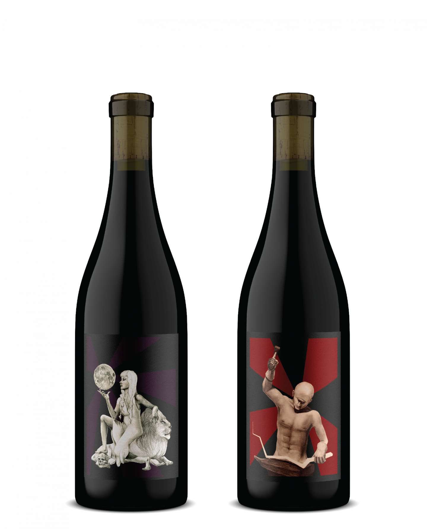
The most recent iterations of these wines (Cyclops III and Nyx) are “companion” wines. They’re both blended from the same material, but in different ratios. The Cyclops is close to thirds Grenache, Syrah, and Mourvèdre, pulling from four different vintages. The Nyx is Mourvèdre and Grenache dominate, with just a splash of Syrah. We had the same barrel samples in the same graduated cylinders, and blended them at the same time in the same trials. We wanted the back labels to tell this story, but in a compelling way.
I had always been interested in the idea of using an info-graphic type of device on a label, and this seemed like the perfect opportunity to try it out. The front labels are pretty far out there, at least when compared to traditional Kiona products. So with these wines already embracing the weird, why not double down?
Idea in hand, I handed the back-label project to the designers at Transom. I explained that I wanted a visual representation of the blend, and provided a few ideas. They took my composition spreadsheet and turned it into a beautiful data visualization. Take a look:
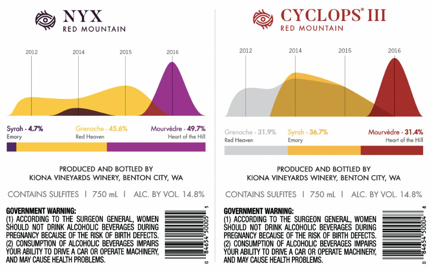
If someone were to stand these two bottles side-by-side, they’d see a nice visual representation of the blends, and (hopefully) have a greater understanding of how they came into being. It’s different, interesting, and fits the personality and philosophy of the wines.
The point of this post is to encourage the reader to pay attention to back label text, and its impact (or lack thereof) on a purchasing decision. Hopefully people are willing/able to share some of their favorite/most memorable back labels, particularly in cases where it resulted in a purchasing decision. Here are a few that I appreciate.
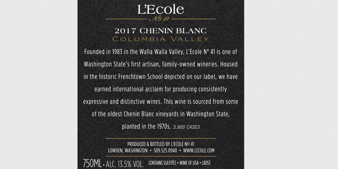
In a few short sentences they've established a place, a history, an explanation of the label and name, and why the wine is worthy of attention. It's really well done. www.lecole.com
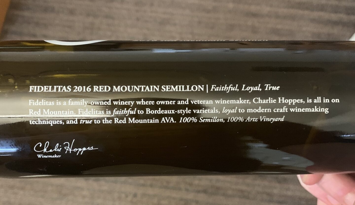
Fidelitas uses this phrasing everywhere, and for good reason. Combining it with information indicating it's a single-vineyard, 100% variety wine is the cherry on top. www.fidelitaswines.com
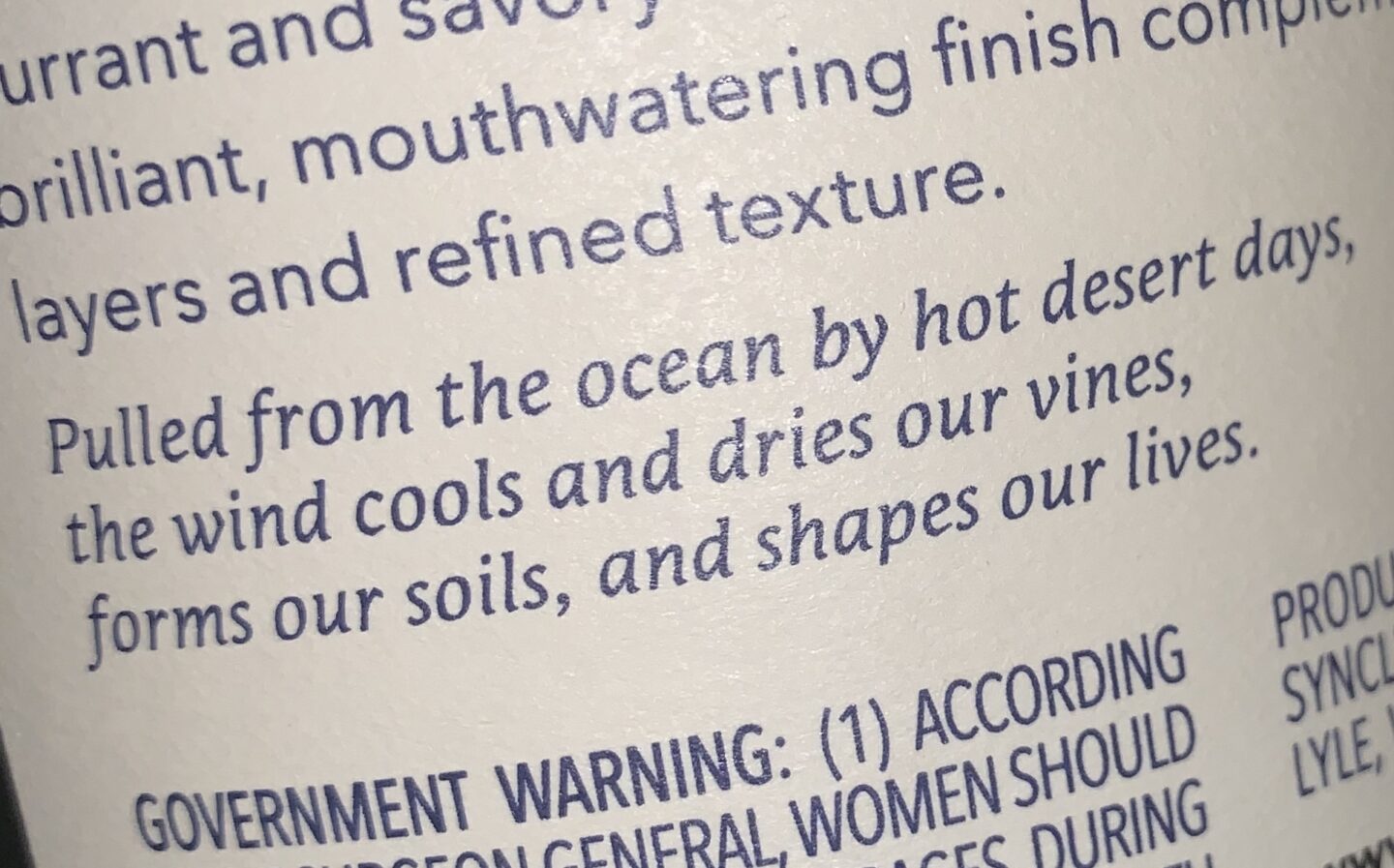
This is on most (all?) Syncline back labels. It's so f***ing good. www.synclinewine.com
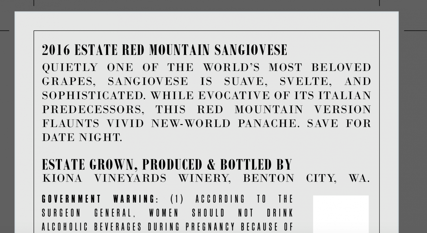
What's the point of writing a blog post if you're not going to do a little self-congratulatory promotion? This back label acknowledges that the reader needs a pat on the back rather than a detailed explanation of the virtues of the grape. They're holding a new-world Sangiovese, after all.